While August is usually considered as one of the quietest months of the year in the photo product industry, we work hard all the time. Recently, we have focused mainly on issues related to the focus of the application and the issue of grouping elements on a slide. This last topic really surprised us, but it was a positive challenge, which we managed to grasp entirely.
Check out what happened in Printbox editors in August.
Focus
- Improving the focus in editors
The focus is an internal mechanism that determines which element of the application is active at which moment and should receive actions from the keyboard. It’s important to have the focus only in one place at the same time, so the system knows what action to perform on what component.
We have changed the way the focus works in the application. This difficult change has solved many of the keyboard’s issues and opened up a wide range of possibilities for further implementation of keyboard shortcuts to make using the editors even more intuitive and convenient.
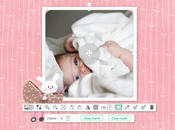
- Clear Mask and Clear Frame buttons in the left panel
This change is linked to a change in the focus performance, which will allow to continue adding well-functioning keyboard shortcuts. Now the Clear Mask and Clear frame buttons are on the Quick Style Panel (QSP) in the content image component and not in the left panel.

- Change in component action during scaling
Now all components have an unlocked ratio (they can be freely stretched). The ratio is locked when the Shift button is pressed and components are being stretched by pulling the corner. Such a change was possible thanks to the focus management in the application.
- Drag of components only on vertical and horizontal axes
Now your customers can drag components with Shift, and then the component holds on to its vertical or horizontal axes.
- Basic keyboard operations in editors
In addition to previously existing keyboard triggers, such as ctrl+c, ctrl+v, ctrl+z, we’ve added the most intuitive basic contextual actions triggered from the keyboard, such as arrow (cursor) movement, Esc, Delete, Shift buttons. Triggers are working during component transformation and stretching. Stay tuned for further development.
Component Grouping
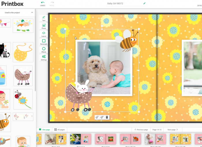
This month we had a lot of work related to the grouping of elements. This topic surprised us with its extent and conflicts with other existing mechanisms. Fortunately, we managed to solve most of the problems and optimize them. Check the most important issues that we’ve managed to cover:
- ESC key operation for groups
- layer control in groups
- removing the restrictions on extending components out of the design space
- groups vs removing components outside the slide
- groups vs history (ctrl+z)
- arrow control for groups
- snapping groups and guidelines
- editing components inside groups
- proportional group scaling

Other features
- Transform changes are not reset during Crop Type and Size changes
We’ve implemented the change in the operation of the Prints editor. Thanks to this improvement changing the print size maintains the cropped area (previously the frame was always reset when the size was changed).
- Cover as separate pages rendering capability
We’ve added the possibility to add cover workspace as separated pages. This feature is useful e.g. for products with a spiral binding, like notepads, yearbooks or photobooks.

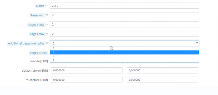
- We’ve added a new value to the additional pages multiplier
From now on you can add the possibility to multiply the number of pages by 8. It can be set in the Additional pages multiplier combo box.

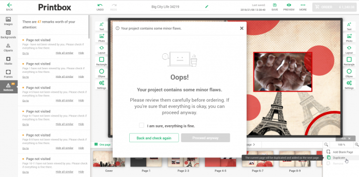
- Optimization of the Presentation Validator
We’ve optimized the project validation process, so that it is launched less frequently (using fewer resources), and yet it takes care of the project’s correctness reliably.

- Hiding the date of birth in the registration form
We’ve added the possibility to hide the date of birth field in the registration form in the e-commerce.
Bug fixes
Take a look at the few, most important bug fixes.
- Using keyboard arrows to move to a different place (letter, digit, space) when changing the font size in the text field moves the whole object.
We’ve fixed the problem of moving in text fields using keyboard arrows – these arrows had previously moved the component.
- Layout with a rotated content image generated a wrong thumbnail
We’ve fixed an issue with an incorrect layout thumbnail in the editor when the component is rotated.
- Displaying slides with different dimensions for the skin and workspace parameters
We’ve fixed a bug with showing the skin when the ratio does not match the slide ratio.
If you need a closer look at any of changes – don’t hesitate to contact me or our anyone from the Printbox team.
Take a look at the live demo HERE and test our online editor yourself (and let us know what you think!).
See you next month!


