Summer is already in full bloom, and for our development team recent time was equally intense. Last month has been full of changes and improvements that affect mobile app. We have added a couple of completely new things and improved some features.
Read what rolled out this time with the last upgrade.
Mobile features
- Vibration
We’ve updated a vibration feature when selecting photos from the library. We’ve slightly changed this feature when selecting photos in the mobile app gallery. Previously, the phone was vibrating when the image limit was almost reached. Now it vibrates only when a user tries to exceed the maximum number of photos. So, if there is a project with 25 empty photo slots and someone tries to upload 30 photos – phone is vibrating.
- Fonts for text fields
Your customers have been able to edit text fields in a mobile application for some time now. In each version of the application, there are now available specific fonts which are supported. If a text with an unsupported font is displayed, the case is covered with appropriate messages.
- Resume file upload
We’ve improved the performance of mobile applications when the Internet connection is interrupted while the project is being uploaded to a server. Now, after each such case, the adequate message is displayed, and after reconnecting and confirming it in the application, users can return to the upload.
- New way of managing photos in the project and gallery
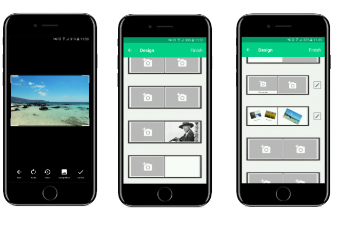
From now on the system do not force your customers to choose a specific number of photos for the project in the mobile application. Your customers can order projects with the number of photos they have added, it doesn’t have to be a predetermined number (as it has been so far).
Thanks to that customers can go to the editor without having selected images yet and select them “on the fly”. Additionally, each of them can be exchanged for another one from the phone gallery at any time.

- Component rotation
If rotated components appeared in the design created in the admin editor, the mobile application will now handle and display them accordingly.
Sales support features
- Related Products
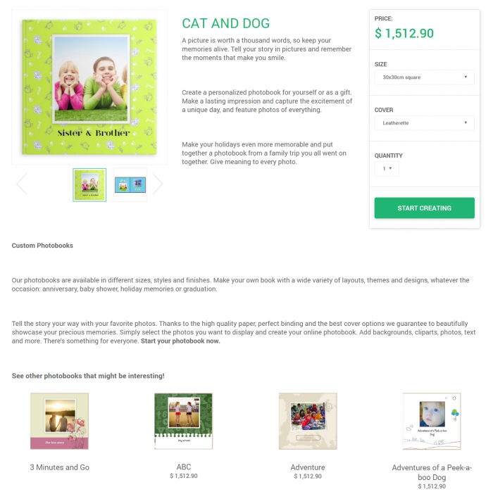
We’ve added a new component: RelatedProducts. It can be selected from the Product Card type steps (or others, if a specific product has already been selected). It displays the first 4 products in the first category to which the product is assigned.
This way you can add a section to your product pages that recommends related products to your customers. This can help to boost sales, as it allows you to show your customers what kinds of similar products are available, increasing the likelihood that they’ll find what they’re looking for.

- An additional feature in the photo calendar editor
We’ve added a possibility to add to a standard monthly calendar a page at the end with the whole subsequent year.
There is a new option in the admin editor for setting the components of the calendar (year, month, days). You can now set whether you want the component to be global (all the global settings apply) or local. The local ones are those that can be individually edited. You can change particular component (set colors, display value for year/month/days, etc.) regardless of what is displayed on other slides. In addition, you can set for global components whether they are to be displayed on the first/last page of the project (thanks to which you have an extra space for local components).
Admin panel features
- Custom designed mailings
We’ve allowed you to use styles and media queries in HTML documents created in the editor for custom emails sent to your customers. This feature is useful if you want to design your own email templates with a unique design and style, using different styling options (colors, backgrounds, etc.) directly while creating the template.
- Auto–scroll to the next attribute
We’ve added a new feature in the admin panel to set scroll to next attribute. A new checkbox has been added to the tiled list of components: “Go to next component on change selected value”.
This way, if your customers will select a value, they will automatically be moved to the next component in the given step. This feature is especially useful for long lists, e.g. for canvas with a variety of themes and other attribute (like size) on the same list.
- Missing assets marked in the theme
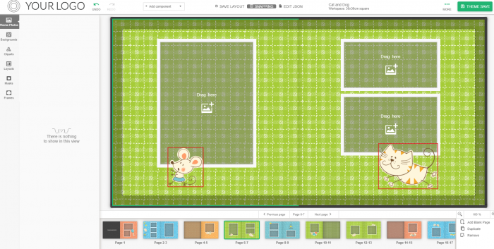
If there are assets in a given design that are not assigned to that theme (e.g. after deleting a tag), now, apart from a pop-up that appears when opening the admin editor, they are marked with a red border in the admin editor.

If you need a closer look at any of changes – don’t hesitate to contact me or our anyone from the Printbox team.
Take a look at the live demo HERE and test our online editor yourself (and let us know what you think!).
See you next month!


