
The times of designing a website adjusted to a computer screen only are over. Optimizing the site for mobile devices is a new golden standard, even though it does not necessarily mean that you have already met all the users’ needs.
In the photo printing business, the crucial part is to take care of the RWD of online editors, including those for creating photo books and other photo products.
To ensure your site and editors are RWD compliant and you offer the highest level of experience on all devices, check out a few responsive design best practices for photo printing companies.
What is Responsive Web Design?
Responsive Website Design, or simply Responsive Design, is a technique that allows you to deliver the same content and functions to users on different devices using only one codebase.
When a user switches from a laptop to a tablet or smartphone, the site should automatically shift to accommodate the resolution, image size, and scripting capabilities. Such an approach eliminates the need to adapt your website design to each new gadget entering the market.
The RWD practice consists of combining flexible grids and layouts, images, and intelligent usage of CSS media queries so that the website appearance should respond to user behavior and factors such as screen size, platform, and orientation. It means ensuring a consistent user interface regardless of the appliance used.
While it may seem that the desktop is the first choice for people looking to create a photo book or other photo product, you should not underestimate the mobile channels. After all, the statistics speak for themselves, as you will see in the following sections of this article.
Crucial statistics to have in mind while considering RWD
To fully understand the importance of the RWD and mobile-friendly approach in business, you should be aware of some crucial statistics and industry data.
General mobile market statistics
- 7.41 billion is the estimated number of mobile phone users worldwide in 2024 (source: statista.com).
- 72.9% of all retail e-commerce will be generated via mobile channels by the end of 2021 (source: statista.com).
- 58% of the total multi-device purchases made in 2020 use mobile devices to close sales (source: merchantsavvy.co.uk).
- 93% of people left the site because it was not displaying correctly on their devices, according to a Hubspot survey conducted in 2020 (source: hubspot.com).
- 74% of users are more likely to return to a mobile-friendly website (source: webfx.com).
- 68% of companies that applied the mobile-first approach to their website recorded an increase in sales, according to the data provided by SAG ipl (source: colorwhistle.com).
- 1.43 trillion is the number of photos taken in 2020. As much as 90.9% of them were made using a smartphone, in pursuance of analyzes provided by The Keypoint Intelligence (source: buymobiles.net).
Photo printing business statistics
- $97 million was Shutterfly’s revenue from the app in Q4 2018, and the overall value of mobile purchases was 27% of the brand’s total revenue (source: fool.com).
- Up to 70% can amount to the share of mobile customers in the overall website traffic in the photo printing industry (source: Printbox analytics).
- 54.51% of photo books are created and ordered on the same day (source: Printbox analytics).
- 19% is the median of mobile traffic on Printbox clients’ websites (source: Printbox analytics).
- Every 10th project, created in Printbox editors, was made in their responsive version (source: Printbox analytics).
If you are still unsure whether or not you should take care about being responsive, continue reading to know the 7 advantages of RWD that can influence your decision.
The main business advantages of responsive design
A responsive website & mobile-friendly photo book editors will provide the best UX on all devices. Nevertheless, this approach has other business benefits which we have listed below.
1. Increase your audience
Your customers will be able to access your website from different devices of all shapes and sizes. Responsive design will adapt to them no matter how big or small their screen is.
2. Make maintenance easier
Having multiple websites for different devices means you have to make any changes to all of them. In the case of a responsive website, you only need to make a replacement once.
3. Achieve lower bounce rates
If your website is not compatible with the device or difficult to handle by mobile, the user will simply move to the competition. Your audience doesn’t want to wait, as they need answers quickly and easily. A responsive website will reduce your bounce rate with fast-loading, easy-to-use navigation, and direct calls to action.
4. Boost the conversion rate
A responsive website can boost your sales as it helps you reach a larger, more targeted audience and give them the right experience.
5. Improve your SEO
To improve search results for mobile users, Google favors responsive websites to appear higher in search engine results.
6. Get consistency in design and branding
You can design and customize mobile and traditional websites. However, you’ll never get the same look and functionality. A responsive site will keep your brand consistent across all devices.
7. Keep track of your data more easily
If you have separate websites for different devices, you need to keep an eye on multiple analytics. A responsive website helps you keep your analyzes in one place.
Best practices in applying RWD for the photo printing industry
Tips for creating a responsive eCommerce website
1. Look over your customers’ journey
At the very outset, you need to analyze and understand the traffic that is reaching your website. Where are your visitors coming from? What devices do they use to browse your online store?
If more than 10% of your traffic comes from mobile channels, this is the last call to bring your website into line with RWD rules.
Nowadays, many companies create a single environment for their websites, considering several devices on the customer’s path. It is because people go through different steps on their various appliances.
Let’s take an example from the world of photo printing.
A customer (let’s call him John) became interested in the photo products offer. He started browsing the assortment of your online store on his mobile phone.
John was especially interested in the possibility of creating a photo book. Using photos from the camera roll on the phone, he designed his first project on mobile. After that, he used a desktop to finalize the purchase.
Therefore, the world of devices permeates constantly. Study each step the client takes and think about how you can manage mobile channels well.
2. Identify “micro-moments” typical of customer-brand interactions on mobile devices
If you have already analyzed the contribution of mobile devices at each stage of the customer journey, it is time to investigate the “micro-moments”. Micro-moments are times when users instinctively approach their device to learn something, get an answer to their question, look for entertainment or make a purchase.
To detect them correctly, you need to analyze the following:
- Customer searches: what kinds of keywords, ads, or queries attract customers to your store on mobile devices? Are there any trends associated with it (like seasonality)?
Printbox Insight
Mobile traffic can change significantly over a year. Among our clients, we observe the highest number of mobile users between November and January, which is associated with the season of increased interest in photo products. The median of differences in their results over the year was 25 percentage points in 2020*.
*The results of the analysis conducted among Printbox customers based on data from 2020.
- Type of content and features: what content user access at each stage of the customer journey, and on what device? Are all elements, attributes, and functionalities available and working right on desktop and mobile?
Printbox Insight
Creating a design like a photo book on a smartphone should be as easy as possible because people won’t spend hours polishing them.
In Printbox, we have introduced Smart Creation and Smart Ideas, which automate the creation of a ready-made photo book from user photos and dynamically create propositions of good-looking spreads.
- Customer flow: How do customers navigate your online store depending on the device they are using? At which stages do they abandon further steps? What are the conversion rates in the desktop and mobile channels?
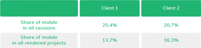
Printbox Insight
In 2020, we conducted traffic and conversion analysis in the mobile channel with 2 of our clients. It turned out that respectively 13.7% and 16.3% of all ordered and paid photo products were generated in the mobile channel. Check the results of the analysis based on data from May to November 2020 below.
3. Concentrate on the mobile user experience
Focus on offering key capabilities across all channels. Users who log in should see their personalized settings, regardless of the device or channel they are using.
Include the mobile context – the circumstances of using the device in a different environment, time, and situation. A mobile device can be used anytime and anywhere, so the context can change constantly and quickly. Usually, it connects with the problems of distraction, multitasking, and poor internet connection.
However, for the photo printing business, more important is the other extreme. Think about using the device in a quiet environment, using a high-speed Wi-Fi connection. Usually, it is in such circumstances that people decide to start their photo book project.
By understanding these details, you can help your clients to complete their shopping journey, as well as ensure your business more profit and a satisfied customer base.
Tips for choosing the best responsive photo book editor
In the photo printing industry, it is not enough for your website to be responsive. Your editors should also meet the requirements of the RWD approach as they go hand in hand with the other pieces of your digital presence. Underestimating the appropriate appearance or functionality of any editor’s element on a mobile device can ruin the user experience.
Jakub Kuśmider, Product Owner in Printbox, has prepared a list of elements that you should pay attention to in the context of RWD in editors for creating photo books:
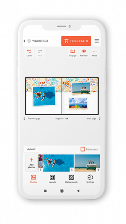
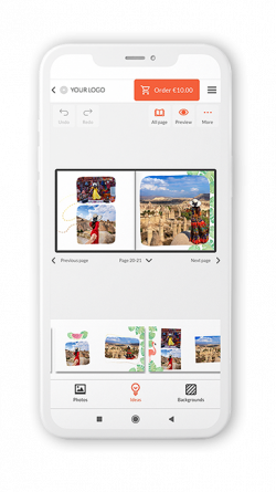
1. The way of adding photos to a project
Most users experiment with selecting photos on individual pages of a photo book, testing different layouts and compositions.
Make it easier for them to add more images to their project by paying attention to display all available photos for use. Instead of a separate pop-up blocking the view of the project, it would be better to present pictures in a separate section, for example, under the project creator’s space.
2. The „preview” feature
The “Preview” module is a crucial function that is often the last step of the user before deciding to place an order. Some people also want to keep an eye on the composition of the entire project and have the preview option available all the time while creating a photo book.
Therefore, make sure that the visualizations of ready-made designs are presented appropriately.
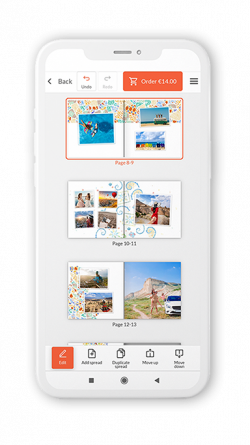
3. Seamless addition of pages to the project
Including additional pages to the photo book project should be easy and intuitive. It is a matter of more than just user convenience. Think about the business aspect – every time a user decides to expand the design and add more pages, you record more profit for your business.
In Printbox, we follow an approach where we place the function of adding a new page on each screen in the editor.
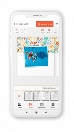
4. Offer photo book editing options wisely
More is not always better. Users overwhelmed by the number of features and editing possibilities may delay the decision to place an order because they will never find their design perfect.
People are concerned about looking through hundreds or thousands of photos to pick the best ones and make beautiful compositions out of them.
That is why we offer our clients Smart Creation, intelligent technology for the automatic design of photo books. It not only reviews user photos but also evaluates the chosen theme.
The Smart Creation automatically prepares a beautiful project with plenty of clipart, backgrounds, text fields, and other items. It will give the extra touch to the pages that customers prepared for their end-users.
Additionally, we have implemented the Smart Ideas function, which further shortens the project creation time by dynamically proposed spreads.
Improve your bottom line with a responsive website
As the web landscape becomes more and more complex, it is highly crucial to deliver a robust user experience in very different contexts. Professional photo printing software can help.
Above, we have mentioned many benefits of responsive website design for the photo printing business. The limitations of the mobile context force us to focus on what content and features are essential and how to present them.
Follow the principles of progressive improvement and eliminate the limitations to lay a future-friendly foundation for your website. It will have a better chance of working well in upcoming browsers and digital environments.
We hope that our tips, best practices, and insights from Printbox analysis will help you conquer the bigger audience on the mobile channel!
Inga Leder-Majewska
Content & Communication Manager in Printbox. She has over 8 years of experience in expert content creation, communication in social media, and PR. In her spare time, she listens to true crime podcasts and plays with her toddler.


