
A landing page is one of the most efficient and popular e-commerce tools. The main difference from the classic home page is a clear call to action without distractions. A good landing page should easily convince visitors to provide their personal details or place an order. But what needs to be done to run a good photo product campaign? To answer that question, we’ve highlighted the main tips for creating a successful landing page for photo product stores.
Set your goals
As with any marketing campaign, there should be a clear target group for each landing page. Before choosing a page design, collect and analyze information about potential customers, their interests, and preferences. Create a list of products you want to place. Is it clear what exactly potential visitors will get from the offer?
For each product group (wedding cards, baby photo albums, Christmas gifts, etc.), we recommend creating a separate landing page and adding keywords related to this category with Google Tag Manager. In addition, you can use landing pages to promote special discounts, limited offers, or simply encourage visitors to subscribe to email updates.
Keep design clear and simple
Customers rate the aesthetic appeal and perceived functionality of the page in less than a second. And during this time, they decide whether to give you a chance or go to competitors. To increase your chances of being in the first category, take the following principles as a basis when designing a page:
Minimalism
Visual simplicity takes into account all the elements of the landing page. Removing unnecessary details or text blocks and giving more white space (or negative space) are fundamental aspects of a minimalist web design. This not only saves the page from a cluttered look but also has a calming effect on the eyes and draws attention to the main offer.
Following the pattern
Good design is about conveying as much information as possible with a minimum of elements. To do this, standardize all page components: fonts, sizes, angles, photos, illustrations, colors, graphics, etc. Even the slightest difference in alignment can change the viewer’s perception and make your page look messy. To avoid this, we suggest using a grid layout when designing. This way, you can be sure that all elements have correct proportions and sizes.
Use visual content to promote and explain
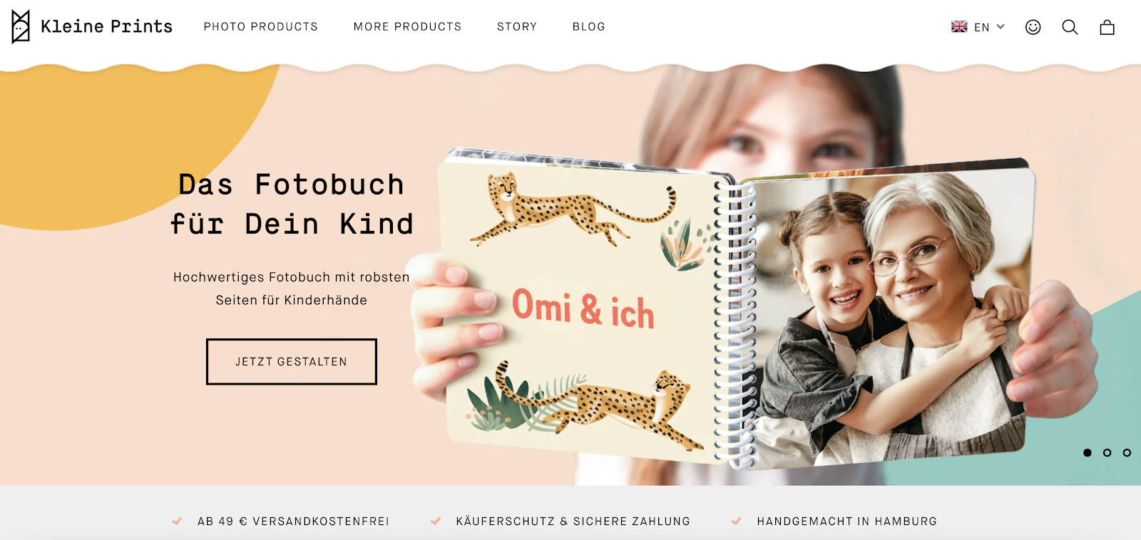
Advertising photo products without photos themselves seem dubious and can discourage your customers from purchasing. On the contrary, if visitors find images immediately after clicking on the page, they’ll shape the first impression about the brand even before reading a description. A good image immediately explains the story of your product and creates a personal connection with visitors. The relevance and quality of chosen images are critical for promoting photo products. Displaying real product images instead of stock ones builds trust with potential customers and allows them to understand better what they are buying. Find more insights on how to boost your visual marketing results on our blog.
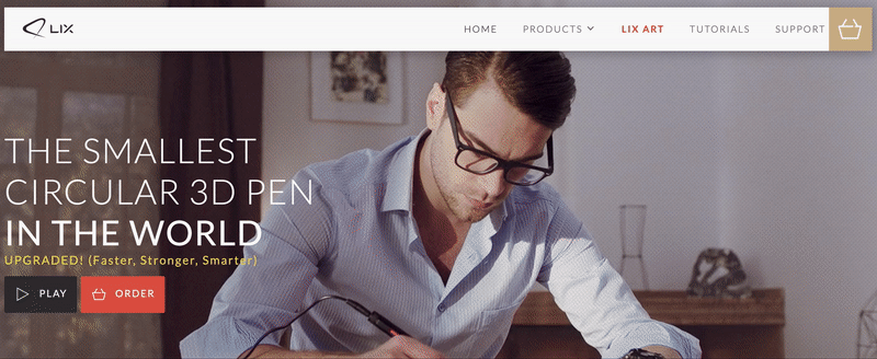
One case study has found that adding videos to a landing page can boost conversions even by 80-86%. Here we should note that a video shouldn’t be long: the best-performing videos run between 30 seconds and 2 minutes. Look at the example from a different industry: the first thing you see on LIX page – a startup that produces 3D printing pens – is their work in action. Just a few seconds give a clear idea of how it works.
Motivate to take action
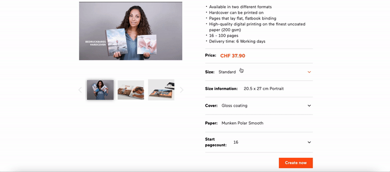
A Call to Action (CTA) is, in fact, any action a visitor should take on your landing page to move forward through the selling process. If potential customers don’t understand the value of your product or service, you lose сonvertion. That’s why a straightforward explanation has a determining role here. A call-to-action element should stand out from the background in order for it to be noticed within seconds, like this bright orange button:
Show social proof
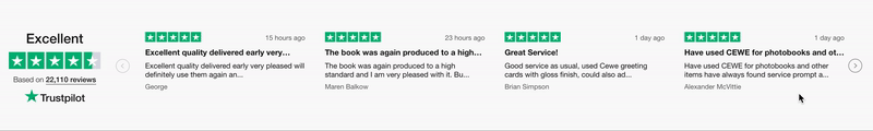
Social media and recommendations play an enormous role in purchasing decisions today. Social proof can be represented by the number of likes, shares, pins, reviews that your brand has. Place them prominently on the landing page. If you haven’t reached a lot of influence in the community yet, even a few well-placed testimonials will hit the spot.
Don’t forget about metrics and optimization
With the help of free tools PageSpeed and Mobile-friendly, you can estimate and improve the usability of a particular page or the whole e-store. Be sure to connect Google Analytics and/or the Facebook pixel to set up goals and track the effectiveness of a new photo product campaign. To drive more traffic, we recommend enabling social media ads, setting up Google Ads, and sending a newsletter to the existing сustomer base (or its specific part) with a link to a new page.
Bottom line
The overall goal of a successful landing page is to increase the conversion rate and consequently, meet business growth goals. There is no standard guideline for creating one, but what makes a good landing page for a photo product campaign is keeping it simple, focusing on the customer’s needs, and constantly following its metrics. And don’t forget that visual appeal is extremely important for selling photo products and related services.


