
We’ve already shown you a few low-cost changes you can make to boost your photo product sales. But we have more tricks up our sleeve in the 2nd part of our guide. Read on for more useful tips to improve your business!
You should never stop improving your ecommerce store. After all, anything that makes the experience better for your customers can only help you in the long run.
Of course, you shouldn’t change your logo and branding every five minutes, but there are always numerous other small changes you can make. Once implemented, these can result in some big results and positive net gains! So, other options do you have?
1. Add Customer Reviews
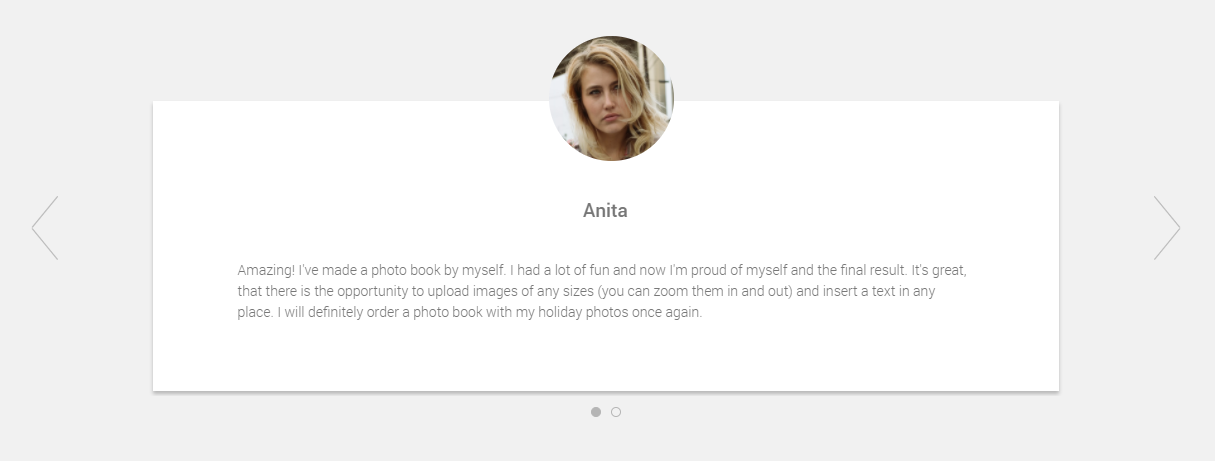
While selling photo products might seem pretty straight-forward, customers will often have questions regarding the quality of your final products. Specifically, they want to be assured about the quality of the print, or even the items that you print on.
Without seeing a physical copy for themselves, they need some sort of proof that your products will live up to their expected standard. Customer reviews do exactly this. By seeing the positive experience of other users, your more hesitant visitors can be convinced to finally take the plunge and try out your photo products.
2. Create An Open Space Design
Don’t be afraid of having a few white areas on your website. Of course, you should make the best use of all the space available, but you shouldn’t fill and cram the entire page with items, text or media.
A clean and light design is much more kinder on the eye, making it easier to users to navigate and understand. When a user can find exactly what they’re looking for – without having to go through dozens of banners, unnecessary blocks of texts and useless pages – it makes for a better experience… and a happier customer.
Creating powerful, effective selling doesn’t need much to work. Sometimes less really is more and a few quality photos, alongside a clear message, can perfectly convey your offers and products.
3. Change Your CTA Buttons
A clear and direct call to action – CTA – is vital for telling customers why they should take the desired action. Don’t just tell someone to “buy now” when they can “create a custom gift”. A clear CTA highlights the benefits for the user. On the other hand, if your visitors aren’t sure what a button does, they won’t click on it.
A good example of a button with clear messaging is a simple “add to cart” feature. Studies have shown that this can perform 49% better than simply using a plus (“+”) icon.
Keep in mind, however, that there is no one golden rule for all stores. What might work for one ecommerce will not always work for another. Try experimenting a little and see what works with your particular audience. Sometimes even something as simple as a change of colour can result in a noticeable improvement for your conversion rates.

So, there you go, some more easy, simple ways to make your website more effective. All of these tips help your users explore your website and order products, which is exactly what you want!
Have you read part 1 of this article? You can check it out here.
Katarzyna Michałowska
Reader. Writer. Communicator. PR & Marketing Specialist at Printbox. Learning from only the best and writing killer copy.


