Online shopping has become a multibillion-dollar revenue stream. According to cmo.com research by Adobe, online shopping retail sales are predicted to grow steadily to $370 billion in 2017, up from $231 billion in 2012.
To get your piece of that growing pie you have to get your shop optimized to look stunning and convince your customers to buy from you.
A modern design and an attractive storefront encourage purchases. A well-designed interface of your e-commerce store allows you to increase your sales. Colors and layout elements influence perception of your web shop.
Here are some simple, universal rules you should consider when designing an online store.
Layout
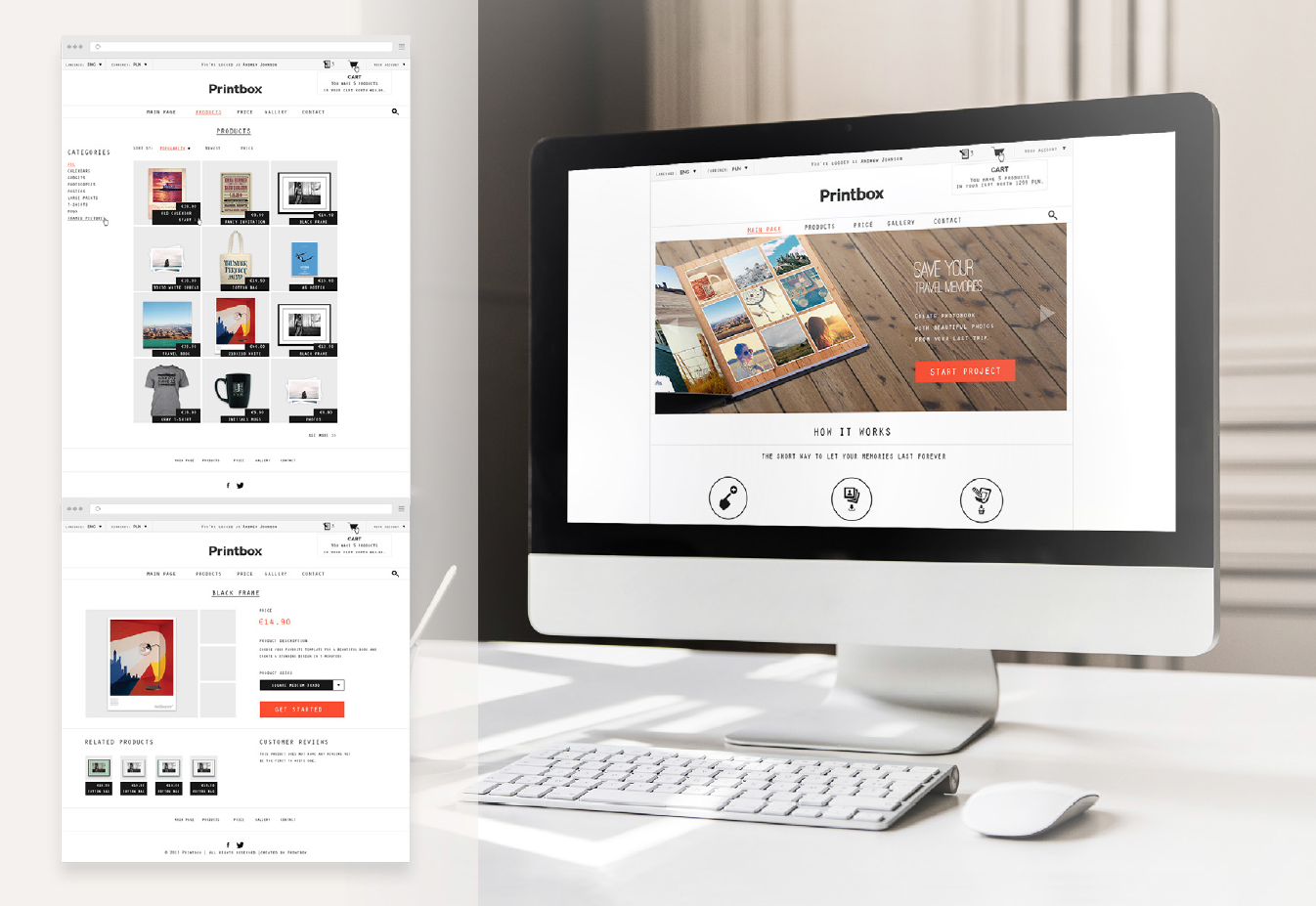
People are used to some typical store layouts, so avoid creativity here. There are several rules that really work. Your logo should be in the upper left corner of the website. It clearly identifies your shop and builds your identity. On the opposite side, the upper right corner, there should be a cart. This is also a typical place to provide your customers a link to the page with contact details. Here we can also place the login box to the customer panel. At the top of the page there should be a search bar. Make sure your products are searchable (with tags). The main area of the site is to present your offer. Don’t forget to place all the legal stuff (Terms and conditions, Privacy policy) at the bottom of your store (footer).
Navigation
Buying online must be fast, convenient and intuitive, so make sure your navigation is adjusted to your product categories. If you sell only photobooks, you can divide them into different categories e.g., for kids, elegant, modern, etc.
Pictures
Modern trends in the layout designs shows that people are attracted to big pictures that tell your story with engaging images. You can showcase your personalized products there. Avoid pictures that have nothing in common with the products in your shop.
Buttons
Add clear Call-To-Action (CTA) buttons and put some text on sliders/ banners to guide and inform your customers what to do next. Research shows that graphics with strong CTA buttons are more appealing.
Product details
Your store is not just the home page. A large number of your customers will enter directly the product detail pages after being redirected from search engines. The looks of your product cards are very important.
Users want their experience while browsing to be similar to those from high street shops. Browsing products on the internet is nothing more than strolling among the shelves of a favorite store. People buy with their eyes, especially where they can’t touch the real product. You have to make sure your visualizations of the photoproducts are stunning.
You should consider putting in really good and clear images at the product detail card. It would be perfect if the pictures could appear in a “gallery view” to be enlarged when your customer clicks on a thumbnail.
Photobooks, photocalendars and other photogifts are a perfect items to display in a “cozy environment”. You can showcase them in an emotional way. This passionate and affecting message sent to your customers can be enhanced with the product description.
Product description
Another “must have” element on your product page is a description. It should be explaining product features and it should definitely allow browsers to index the page (remember to put your keywords to the description). It has to be a few sentences, not only a few words. I realize that in selling many personalized products you would have to write many unique descriptions, but I’m sure your effort will pay off.
You only have a few moments to catch the attention of your visitor and encourage him to purchase. Do not let the customer flee from browsing your store’s offer.
Katarzyna Michałowska
Reader. Writer. Communicator. PR & Marketing Specialist at Printbox. Learning from only the best and writing killer copy.


